For this exercise I chose the topic “information literacy” which had over 3,000 hits in Web of Science.
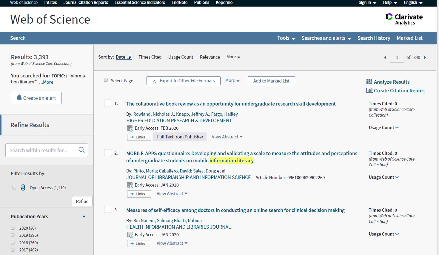 I was expecting there to be quite a few hits for this, so was pleased by the number. Looking through the list, the results were varied in terms of related topics and disciplines.
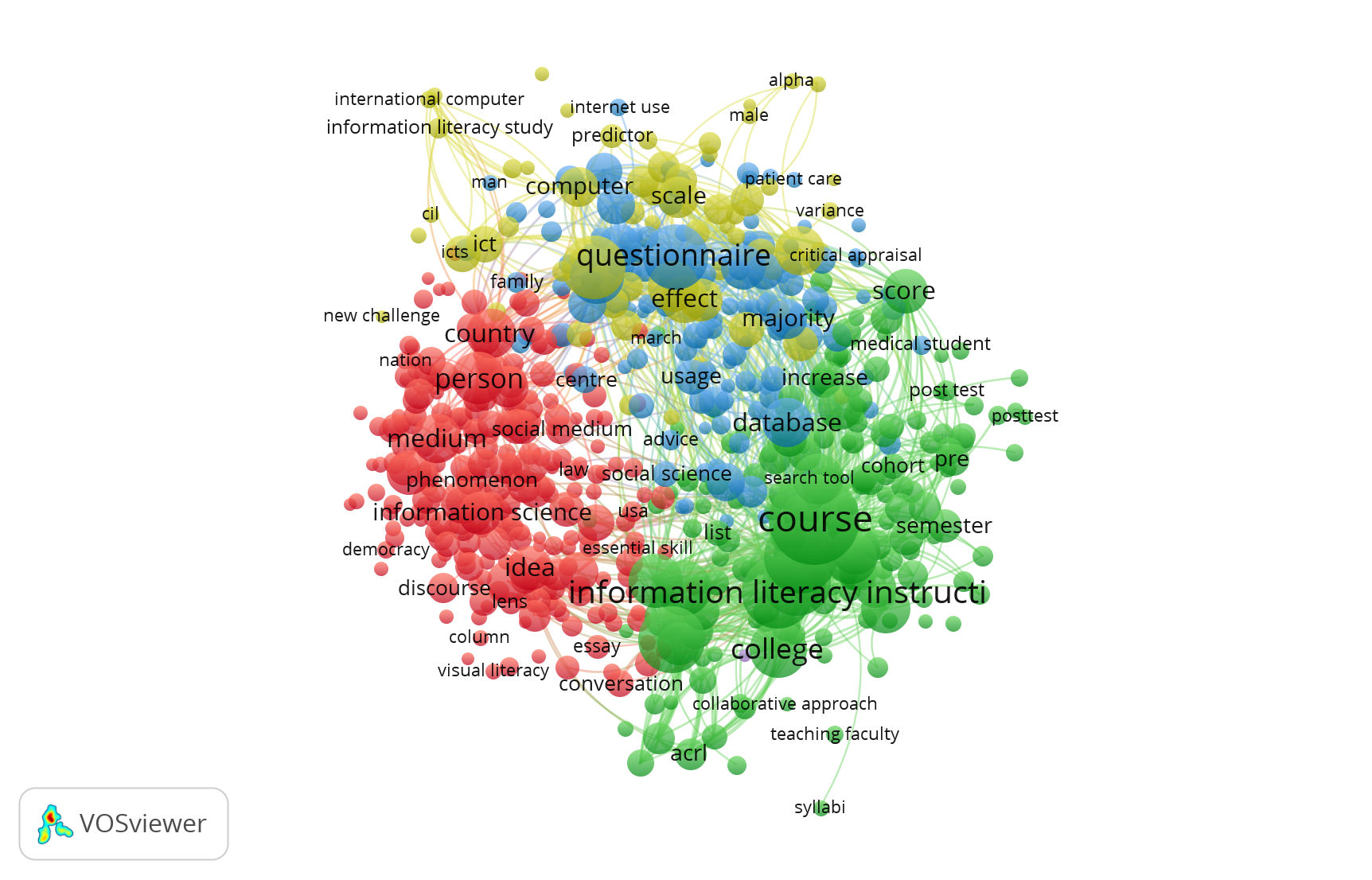
Importing things into VosViewer wasn’t too bad with the tutorial’s help. Here is the first network result:
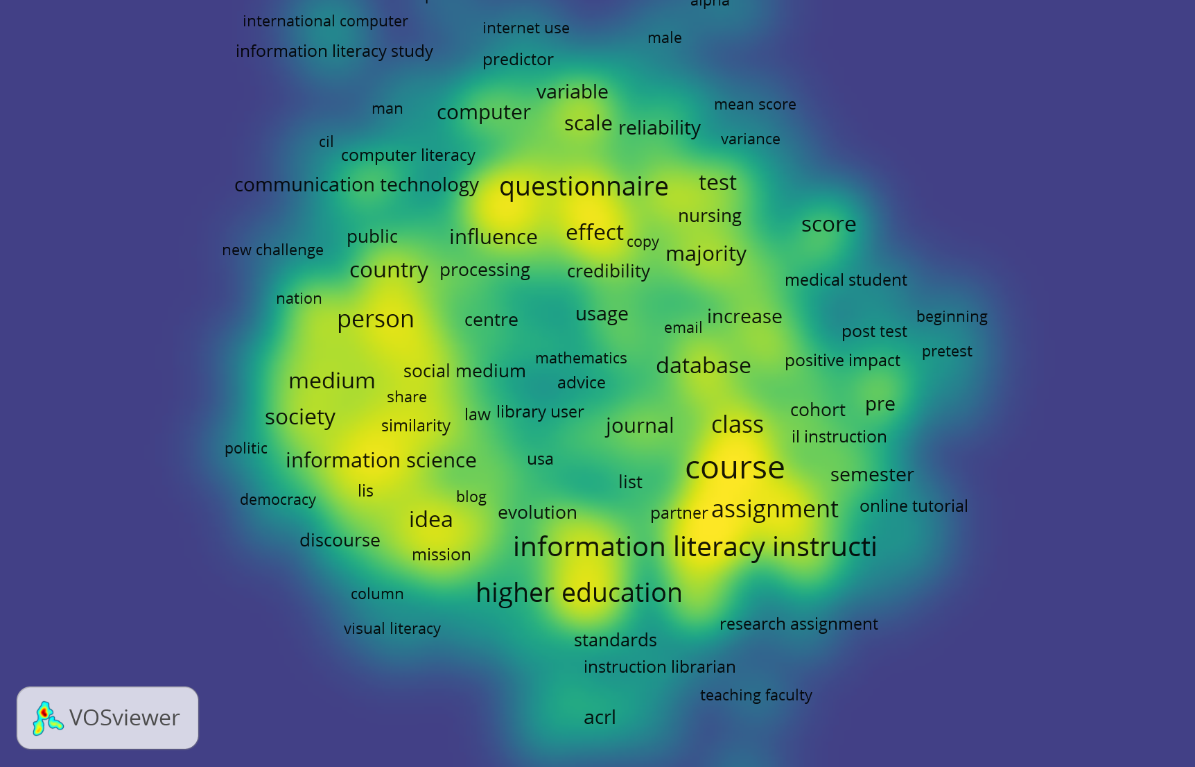
And then when I started playing around, I liked the density mapping with different colors. The heat mapping effect gave a good sense of where to spend attention. The colored topic differences also was a feature I found helpful in my viewing:
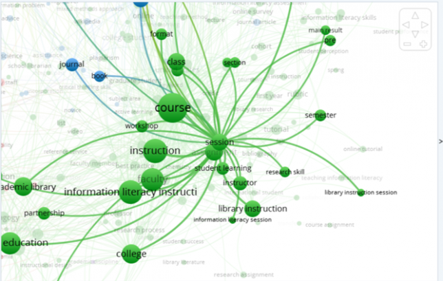
What can you learn from the bibliometric network you have created?
It’s always interesting to look at how things are related. Since this is a topic I’m fairly conversant in I would have expected to see things like “library sessions” and “library” come up more than they did. I see “library user” is one of the nodes. “Higher education” and “course” made sense to me. Something that I didn’t expect, but makes sense in hindsight, are the words associated with the kinds of studies done about information literacy. Words like “survey,” “mean score,” “post-test,” “scale,” and “predictor.” Since this is coming from Web of Science I can assume that the research methods skew empirical in the sample dataset, and those kinds of words and topics would make sense in association with studies on information literacy.
How does your choice of data limit your analysis?
Again, since this is Web of Science, we are getting a lot of studies about information literacy. I’d guess that if you did this kind of analysis with more widely circulated texts that are used by run-of-the-mill librarians you’d get more topics that are case studies, anecdotes, or are about teaching one-shot library sessions. You’d find more on pedagogy and teaching practice, in other words. Instruction librarians tend to be practitioners so lesson plans tend to trump empirical research. That isn’t to say the research isn’t out there, or being done, or being read. It might not be quite so immediate as this data set would make it seem.
Obviously, there is a very large node that says “Information literacy instruction” but one thing that is missing are some of these other ideas being connected to it–one shots, pedagogy, and the like.
How can you structure your data to change your analysis?
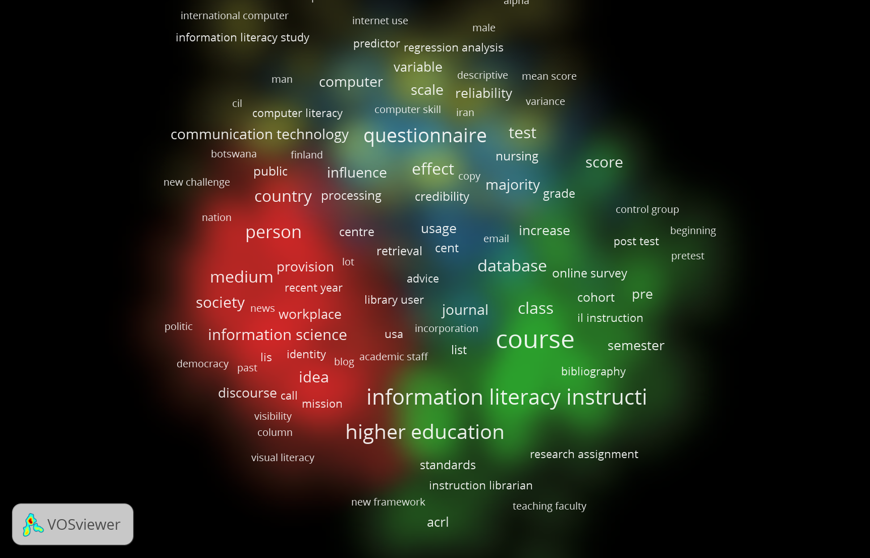
I’ve played around with a few things here. One thing that I really like are the exploratory features which allow you to zoom in on certain data points. So, since the question of pedagogy came up for me, I tried to use the filters on the side to see what terms were associated with “library session” and I found the following: information literacy session, library instruction session, and session. Then, I can click “session” and see what this word is co-occurring with to see what those relationships are. This is a cool way of answering questions that arise from the initial overview with all of the terms. I felt like this part of the network was lost to me at first, but here I see that there are some articles about education, pedagogy, and library teaching in this dataset. I like to see how they are related and the relative frequency of each (and how related they are as evidenced by proximity).
I’ll be honest, I’m trying to manipulate the data in other ways but am not seeing huge differences in my network output, so I’ll be excited to learn more about this in class.