I chose to examine just one article and it’s citation’s network: Bynum, Carolyn Walker. “WHY ALL THE FUSS ABOUT THE BODY, A MEDIEVALIST’S PERSPECTIVE.” Critical Inquiry 22, no. 1 (Fall 1995): 1-33.
It pulled up 130 citing articles with a total of 683 times cited. H-index is 16. It’s number of citations has steadily grown from it publication in 1995 to its peak in 2012 with 64 citations that year. With the exception of 2014, when it had just 45 citations, it has remained around 60 citations per year through 2019.
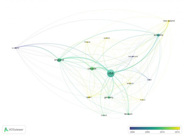
Bibliographic Coupling by Country, Overlay Visualization
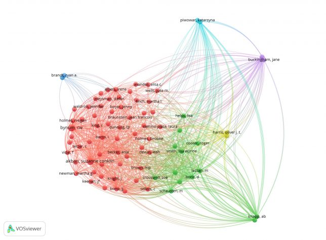
Bibliographic Coupling by Author, Network Visualization
Bibliographic Coupling by Document, Network Visualization
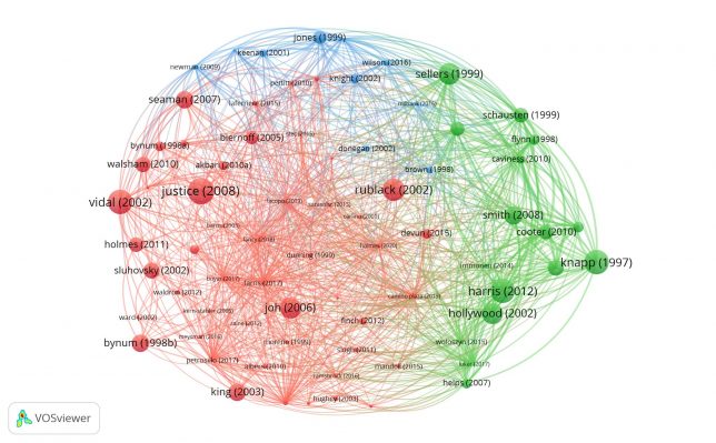
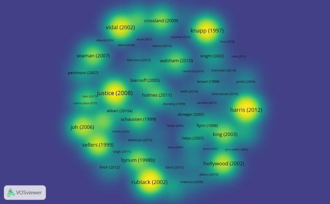
Citation by Author, Density Visualization
Citation by Documents, Density Visualization
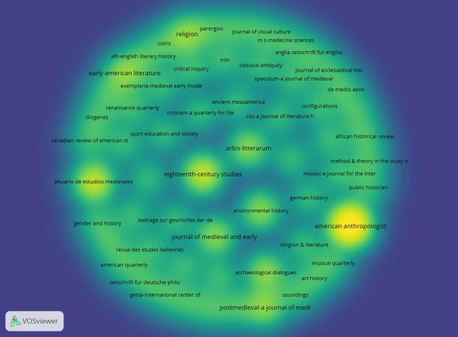
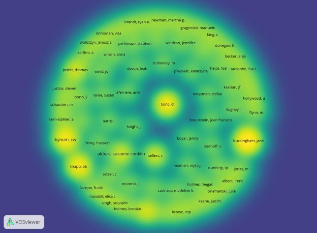
Citation by Source, Density Visualization
What can you learn from the bibliometric network you have created?
I created a variety of networks from this data but, for the most part, I’m not finding the information they are providing all that useful. From the bibliographic coupling networks by author and by country, I’m able to see that the majority of the articles are coming from the US, the UK, and Canada, and from a pretty close-knit scholarly group with a handful of outliers. The density visualizations of citation networks by author and documents give us a couple of authors and articles who cite densely Bynum’s article. Perhaps, the most interesting density visualization was the citation network by source which highlighted for me, among the many medieval journals, two interesting hot spots: American Anthropologist and Eighteenth-Century Studies. When I looked back at the data in the Web of Science citation report, however, I realized that the visualization was actually misleading (or at least the screenshot of it) because, although there were 7 articles from American Anthropologist that cited Bynum, there were 14 from the Cambridge Archeological Journal (which I can’t see in the visualization) and 11 in Environmental History (which barely stands out in the network). There were 3 articles from Eighteenth-Century Studies, which is the same number as in Speculum (a source that doesn’t stand out at all in the visualization).
How does your choice of data limit your analysis?
My analysis is obviously limited because of Web of Science’s limited resources for humanities scholarship. By choosing to take data for one article, I’m also working with a rather small data set.
How can you structure your data to change your analysis?
My data set includes self-citations—removing those self-citations would change my analysis slightly. I also did not examine text networks, which I suspect would give me a broader picture of the citations than I would expect.