The first network I used was “Urban agricultural history.” This network brought back 529 documents. Of the 17,076 terms found, 308 occurred over 10 times. The terms that were deemed most relevant were quite surprising to me. Species richness, metal, species composition, lead, and stream were all stratified as most relevant with a score in the 3.0s. None of these terms exceeded 20 occurrences. The terms most frequently used, however, were site (107 occurrences), effect (103), species (90), and century (80). By taking out these most frequently used terms, the chart becomes quite different. The most number of cluster terms become human activity, water quality, agricultural activity, and several others which were not previously the highest number of cluster terms.
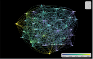
The second cluster I made got rid of most terms by only viewing terms that appeared over thirty times. Out of the 17,076 terms, only selected 58 terms, and only 35 of those deemed relevant. The most used terms were now history (353 occurrences), area (251), development (173) and process (109). Furthermore, many of the terms like China were included in the results, but no longer had a visual representation on the map. Moreover, in the second cluster set, nearly every term visually represented on the map connected with every other word/term. The universalism/ ubiquitous relationship between all phrases stood out compared to the first cluster.
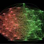
I found it fascinating to observe clusters that started from methodological phrases like case study, and to then trace what other terms were associated with case study. I also loved using the software to trace clusters and patterns. Unfortunately, I am not sure my understanding of the software and manipulation of data sets is currently strong enough to articulate meaningful criticisms of the program. (Which should make tomorrow’s class even more interesting!)